I am the author of iOS 17 Fundamentals, Building iOS User Interfaces with SwiftUI, and eight other courses on Pluralsight.
Deepen your understanding by watching!
Circular Progress Indicator in Swift
Updated on April 17, 2017 – Swift 3
Circular progress indicators are a nice and compact way to visualize progress information for users of your iOS app. I was extremely grateful to come across Kaan Dedeoglu’s KDCircularProgress project on GitHub. It’s a versatile little UI component written in Swift that provides a great amount of flexibility and customization options. I love it!
As a bonus to this amazing component, recent contributions by Kaan have opened up the ability for us to lay out and set up the circular progress indicator in the Storyboard!
My goal in this article is to help get you up and running with this library in your own Storyboard-based Swift project.
Example project
Kaan’s GitHub repository has an example project, but I’ve also gone ahead and made one as well for showing how to use this indicator in a Storyboard. We’ll be using the example I created as a reference point for the forthcoming walk-through.
Getting started
The most obvious starting place is to head over to the KDCircularProgress repository on GitHub to grab the KDCircularProgress.swift source file and add it to your own Swift project. Kaan has things set up with CocoaPods as well if you care to use that. I found adding the .swift file to my project to be the least intrusive way to add this indicator to my UI components arsenal.
To the Storyboard!
Since Kaan added IBDesignable and IBInspectable support, working with the circular progress indicator in the Storyboard is super easy.
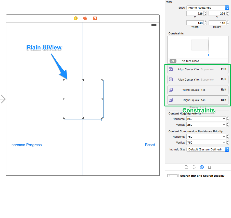
To get started, all you need to do is drag a plain View over to the Storyboard Scene. Set up your constraints to correctly position the view where you need it:
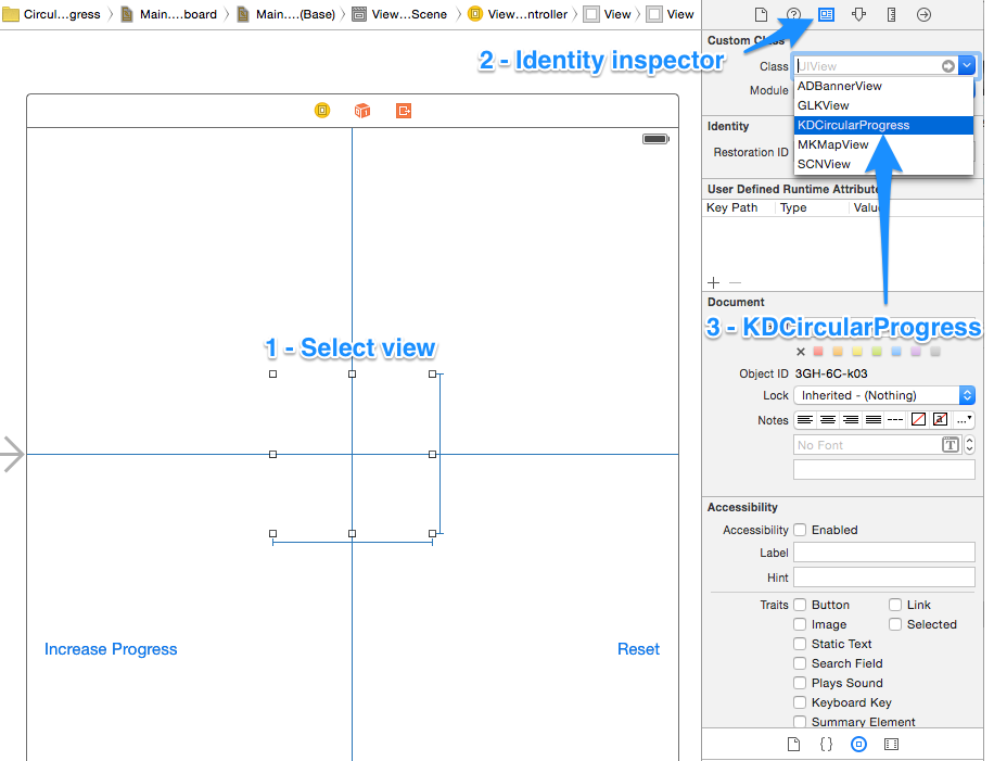
Next, you need to set the View’s class to a custom class, namely, KDCircularProgress:
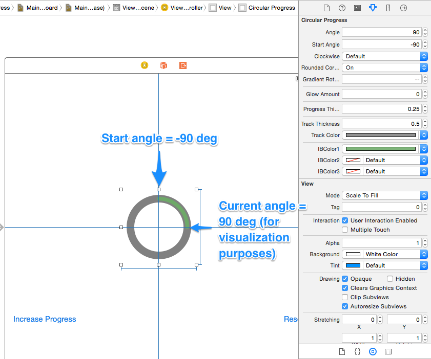
With that in place, Xcode will process things and allow you to modify the properties of the progress indicator directly in the attributes section of the Utilities pane. Best of all, you’ll see those changes be reflected in the Storyboard scene in real-time as you adjust values!
viewDidLoad()
While in the Storyboard, I set a few values so that I could actually see certain colors when progress had been made. However, to get things set to their true initial state, there may be some values you want to reset in viewDidLoad(). For example, I set the angle property to 90 degrees so that I could see the color of the progress track in the storyboard. But when I load the app, I want the angle to be 0 degrees (since no progress has been made when the app first loads).
To accomplish this, you’d simply make sure there’s an outlet between your progress view in the Storyboard and the View Controller. Once they’re connected, you can write something as simple as circularProgressView.angle = 0 to start off with no progress.
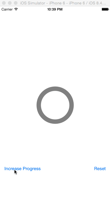
Increasing progress
We’re dealing with a progress indicator here, so this implies that there’s a beginning, some incremental steps taken toward a completion goal, and of course, the fully completed whatever it was you were doing.
The example I’ve contrived is a simple counter with an upper limit of 5. So as you tap “Increase Progress”, the circular progress view should update to be some fraction of the way around the 360 degree circle based upon how close we are to completing the count to 5.
There’s a function I’ve built to calculate the new angle:
1func newAngle() -> Double {
2    return 360 * (currentCount / maxCount)
3}
The rest is simply a matter of updating the current count and animating to the new angle:
1@IBAction func increaseProgressButtonTapped(sender: UIButton) {
2    if currentCount != maxCount {
3        currentCount += 1
4        let newAngleValue = newAngle()
5
6        circularProgressView.animate(toAngle: newAngleValue, duration: 0.5, completion: nil)
7    }
8}
Resetting the indicator
To reset everything, we’d want to update the state of our current count back to 0.
The change to the circular progress indicator’s visualization of the progress state can be animated by calling the view’s animate(fromAngle:toAngle:duration:completion:) method:
1@IBAction func resetButtonTapped(sender: UIButton) {
2    currentCount = 0
3    circularProgressView.animate(fromAngle: circularProgressView.angle, toAngle: 0, duration: 0.5, completion: nil)
4}
Wrapping up
There are a ton of other customization options that you can play with. I highly recommend this UI component if you’re looking for an easy-to-use, versatile circular progress indicator!